
HDB Colour-Coded Directions Signs as Wayfinding For Dementia Friendly Community in Yishun, Singapore17/4/2021 A series of community initiatives has recently been implemented to make some of the neighbourhood estates in North Singapore more dementia-friendly. For the people staying in North Singapore, did you notice that the facades of some Housing Development Blocks in high-traffic areas near Yishun (a.k.a. Nee Soon) were painted recently with striking colours and symbols? Similar to zoned carparks, the blocks feature icons - pineapples for red blocks, fish for blue blocks and rubber trees for green blocks. Block numbers were painted prominently on the sides of the blocks and their pillars. The colours stand for different zones in the neighbourhood, comprising Blocks 837 to 850 Yishun Street 81/82. They are part of an effort in making the area more dementia-friendly, in other words, to better help persons with dementia find their way around the neighbourhood. Persons with dementia often find it difficult to navigate even their own neighbourhood, and risk losing their way. Mature residential environments are especially difficult for wayfinding due to high-rise almost identical height buildings. One promising intervention to make an environment more supportive for wayfinding is to enhance it with salient cues, especially since many environments that seniors inhabit lack salient environmental information. Salient cues are those that grab the user’s attention and stand out from the surround such as a large brightly illuminated statue. The rationale for using salient cues is that they address the problem of wayfinding both visually and cognitively. Visually, salient cues can stand out from the surround, attract the wayfarer’s attention, and are more likely to be seen by the aging eye. If a person with dementia were to ask for help, or if somebody were to find him looking lost, even if he cannot remember exactly which block he lives in, he might be able to recall the colour or icon. This will help people to lead him back to where he lives. 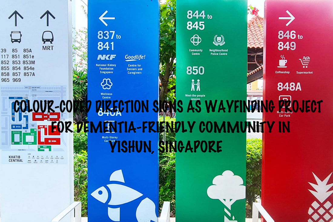 Signages to nearby supermarkets, coffeeshops, and block numbers come in larger fonts which are more recognisable too. On top of colour codes, as mentioned earlier, each zone also corresponds to a different icon, such as rubber trees, fish, and pineapples. These symbols were chosen because they have historical significance to Nee Soon town. 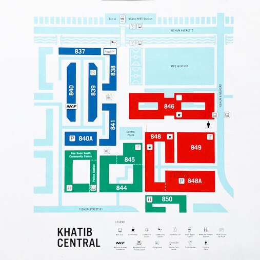 Blocks were painted with bold colours for easy identification. This map was painted on every lift shaft facing the public on the ground floor. 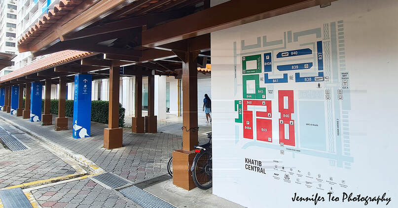 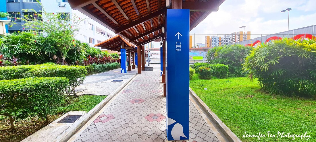 Directional signage that points to key amenities in the neighbourhood. 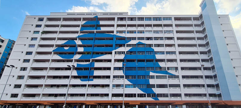 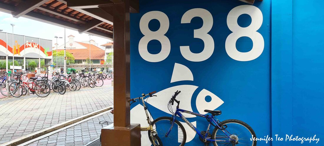 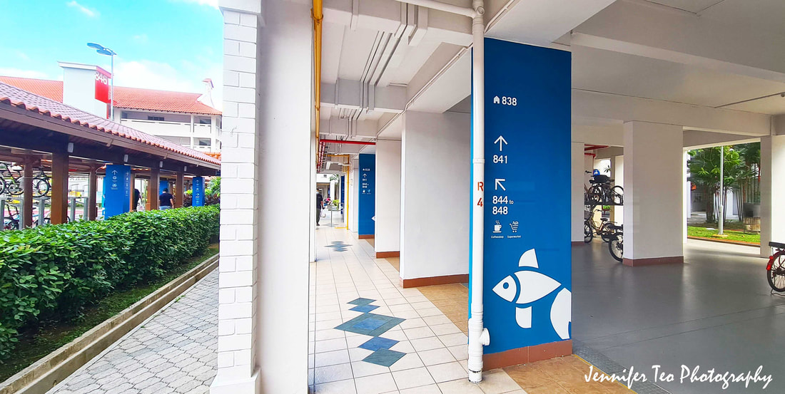 Wayfinding at eye level allows elderly to locate their destination easier. 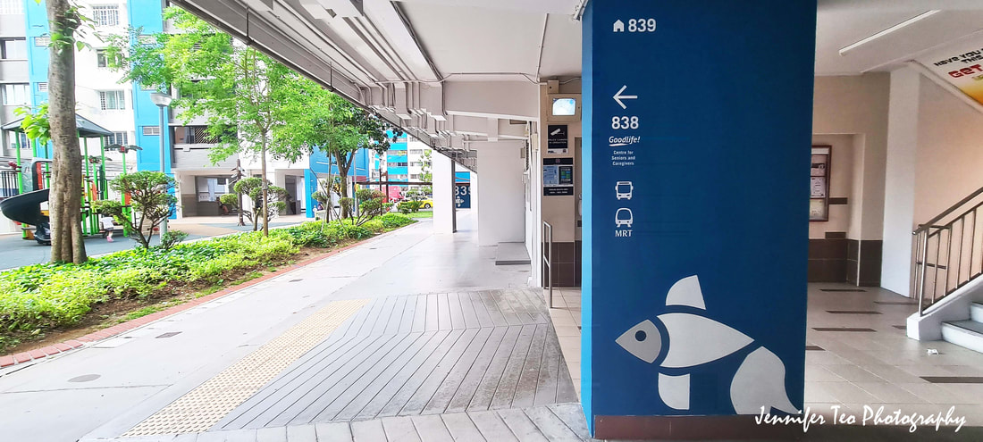 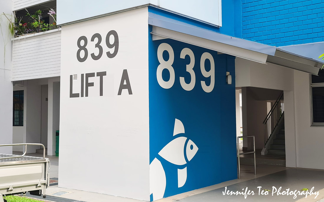 Large font and symbol on a bold coloured wall provide visual stimulation for the elderly and those with dementia to navigate easier in the familiar surrounding. 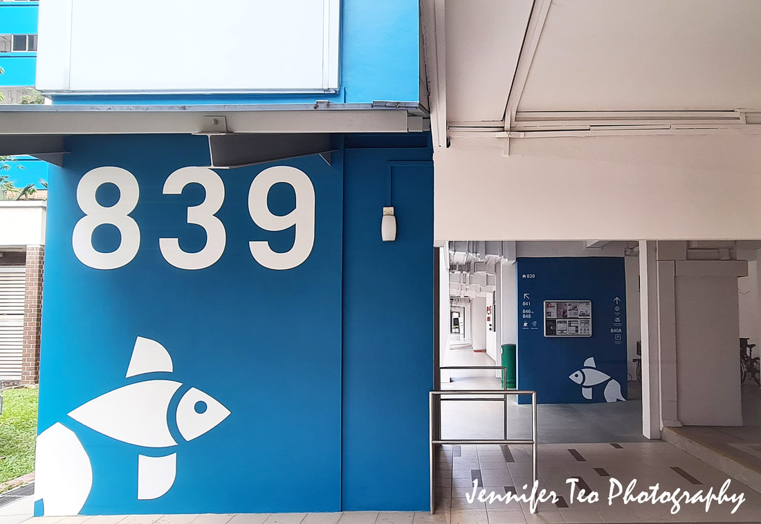 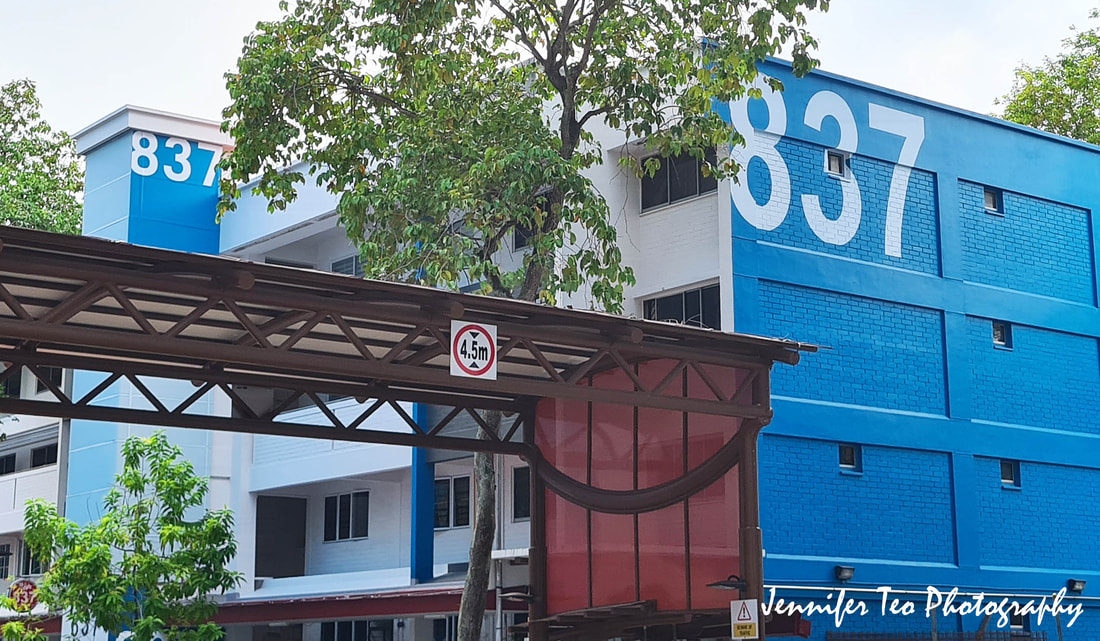 Large numbers and bold colour make it easier to identify the blocks from afar. 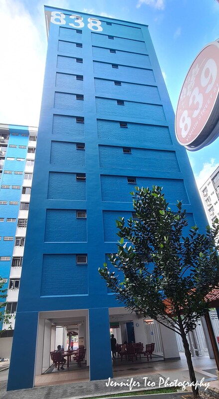 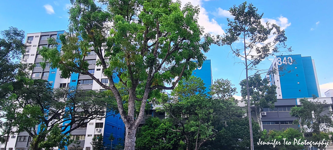 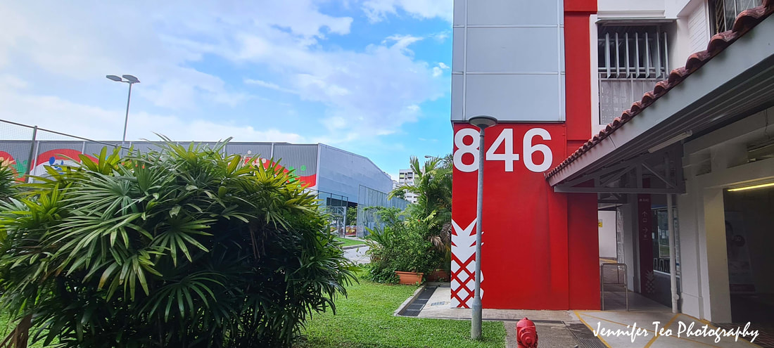 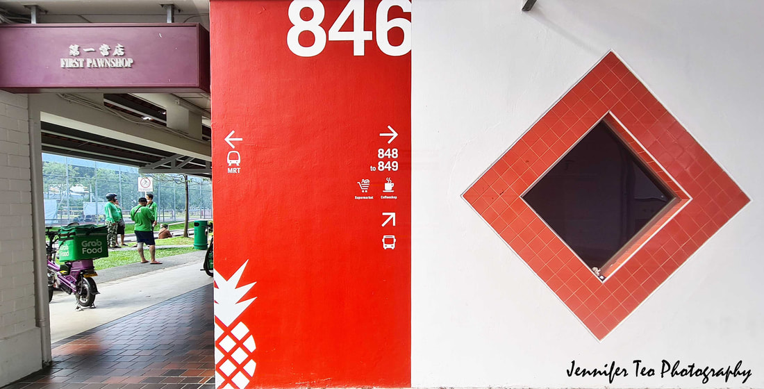 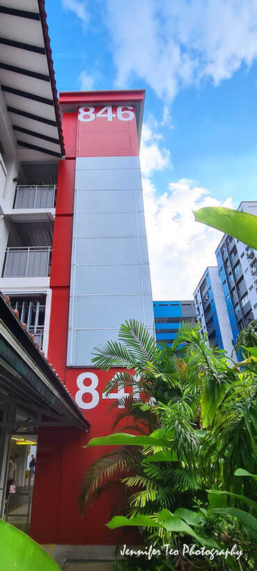 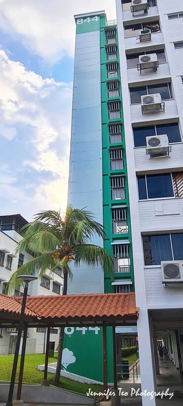 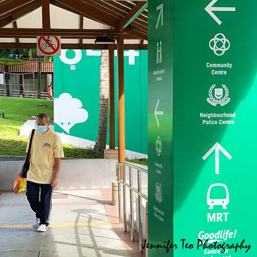 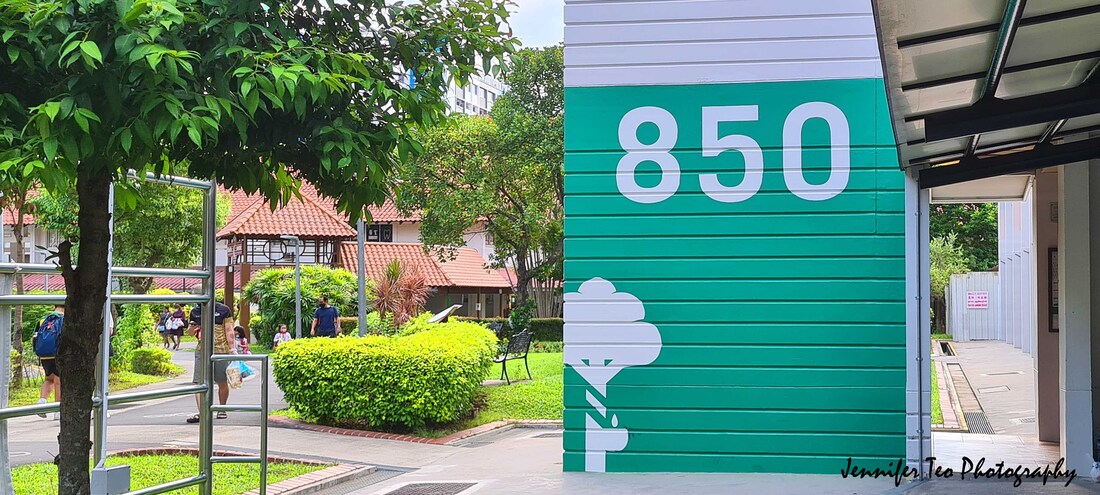 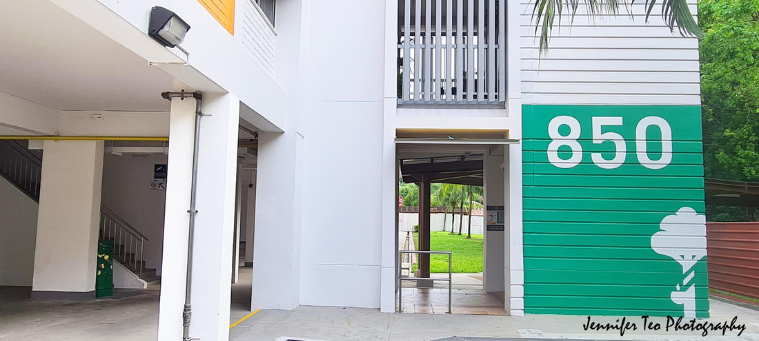 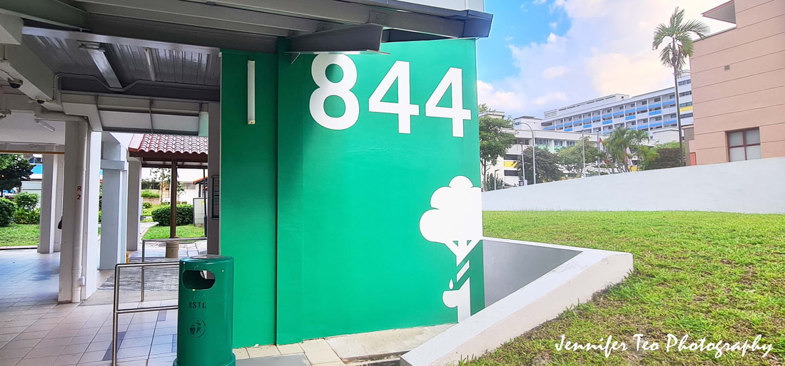 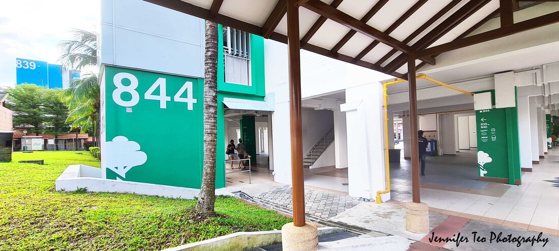 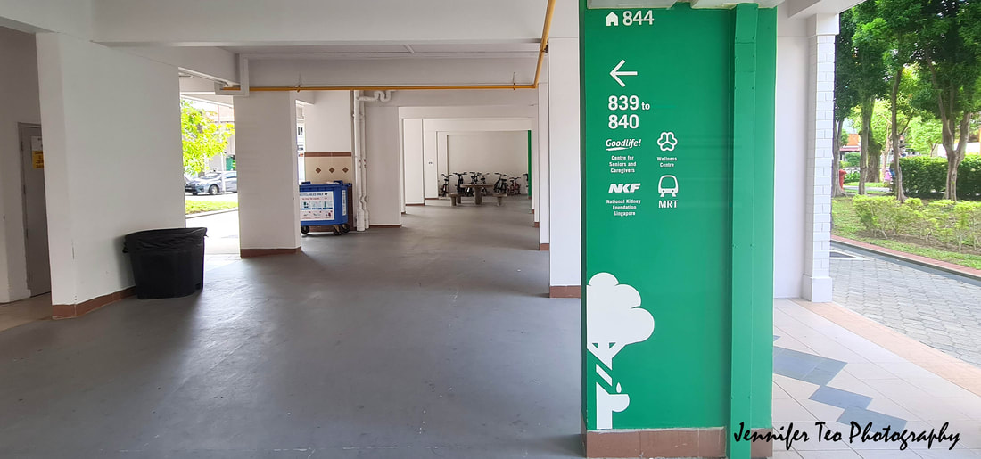 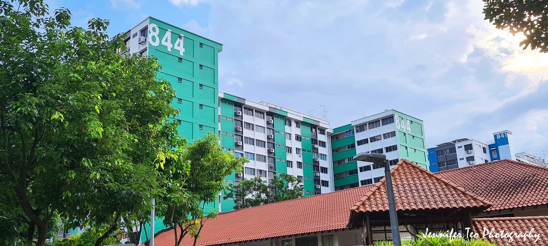 This wayfinding project's hard work of Nee Soon South grassroots organisations, the Agency for Integrated Care, Nee Soon Town Council, Khoo Teck Puat Hospital and the GoodLife! @Yishun centre, which is run by social service agency Centre for Livable Cities and Montfort Care, cannot be ignored.
By 2030, 1 in 4 Singaporeans will be aged 65 years and above. Seniors also tend to spend more time within their neighbourhoods. Well-designed neighbourhoods that provide support and care services for seniors to age well and gracefully are important. Thus, relevant urban design and guiding principles were used. It’s heartwarming to see such innovative yet practical concepts being realised in action. Hopefully, they would help the elderly in Nee Soon venture out more confidently and independently. Check it out the other wayfinding project for dementia friendly community in Ang Mo Kio which I have photo-documented last year:
0 Comments
Leave a Reply. |

Author
|
 RSS Feed